STOP COPYING YOUR COMPETITORS
Your competitors can show you what’s already working. They shouldn’t decide what your brand looks, sounds, or feels like.
Insights

THE TRAP
Looking at your competitors is useful. Copying them isn't.
When building a brand, it's natural to look at what others in the industry are doing.
You notice the colors they use, the style of their websites, their photography, their tone of voice, and suddenly your brand starts moving in the same direction.
It feels safe.
But safe brands are rarely memorable.

THE PROBLEM
If you look like everyone else, why should people choose you?
When competitors start looking similar, customers have fewer visual cues to tell them apart.
The same colors.
The same typography.
The same layouts.
The same messaging.
Your brand might look professional, but it becomes difficult to remember.
And being “as good as the competition” isn't the same as being distinctive.

THE DIFFERENCE
Your competitors should be part of the research, not the reference.
Before deciding how a brand should look, you need to understand where it can stand apart.
What does the category already look like?
What does everyone expect?
And more importantly: where is the opportunity to do something different?
The goal isn't to be different just for the sake of being different.
It's to find a visual and strategic direction that makes sense for your brand.


THE RESULT
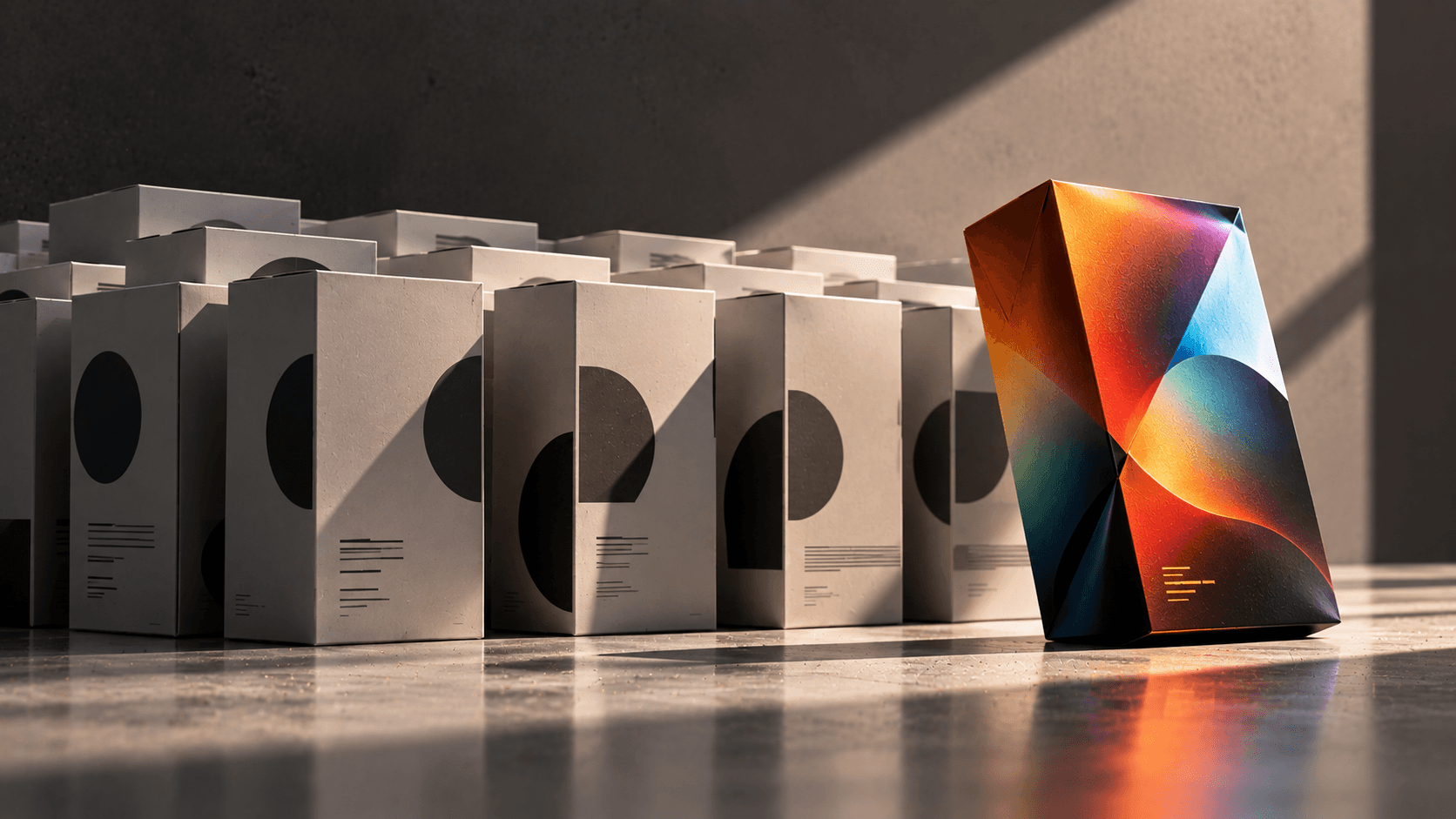
The strongest brands don't look like the category. They own their space within it.
A distinctive identity gives people a reason to notice, remember, and recognize your brand.
So study your competitors.
Understand them.
Then close the tab.
Build your brand around what makes you different, not what makes you fit in.
More to Discover


STOP COPYING YOUR COMPETITORS
Your competitors can show you what’s already working. They shouldn’t decide what your brand looks, sounds, or feels like.
Insights
THE TRAP
Looking at your competitors is useful. Copying them isn't.
When building a brand, it's natural to look at what others in the industry are doing.
You notice the colors they use, the style of their websites, their photography, their tone of voice, and suddenly your brand starts moving in the same direction.
It feels safe.
But safe brands are rarely memorable.
THE PROBLEM
If you look like everyone else, why should people choose you?
When competitors start looking similar, customers have fewer visual cues to tell them apart.
The same colors.
The same typography.
The same layouts.
The same messaging.
Your brand might look professional, but it becomes difficult to remember.
And being “as good as the competition” isn't the same as being distinctive.
THE DIFFERENCE
Your competitors should be part of the research, not the reference.
Before deciding how a brand should look, you need to understand where it can stand apart.
What does the category already look like?
What does everyone expect?
And more importantly: where is the opportunity to do something different?
The goal isn't to be different just for the sake of being different.
It's to find a visual and strategic direction that makes sense for your brand.
THE RESULT
The strongest brands don't look like the category. They own their space within it.
A distinctive identity gives people a reason to notice, remember, and recognize your brand.
So study your competitors.
Understand them.
Then close the tab.
Build your brand around what makes you different, not what makes you fit in.
More to Discover
STOP COPYING YOUR COMPETITORS
Your competitors can show you what’s already working. They shouldn’t decide what your brand looks, sounds, or feels like.
Insights
THE TRAP
Looking at your competitors is useful. Copying them isn't.
When building a brand, it's natural to look at what others in the industry are doing.
You notice the colors they use, the style of their websites, their photography, their tone of voice, and suddenly your brand starts moving in the same direction.
It feels safe.
But safe brands are rarely memorable.
THE PROBLEM
If you look like everyone else, why should people choose you?
When competitors start looking similar, customers have fewer visual cues to tell them apart.
The same colors.
The same typography.
The same layouts.
The same messaging.
Your brand might look professional, but it becomes difficult to remember.
And being “as good as the competition” isn't the same as being distinctive.
THE DIFFERENCE
Your competitors should be part of the research, not the reference.
Before deciding how a brand should look, you need to understand where it can stand apart.
What does the category already look like?
What does everyone expect?
And more importantly: where is the opportunity to do something different?
The goal isn't to be different just for the sake of being different.
It's to find a visual and strategic direction that makes sense for your brand.
THE RESULT
The strongest brands don't look like the category. They own their space within it.
A distinctive identity gives people a reason to notice, remember, and recognize your brand.
So study your competitors.
Understand them.
Then close the tab.
Build your brand around what makes you different, not what makes you fit in.